For this university project, I rebranded Gabriola Land and Trails Trust (GaLTT), with the goal of modernizing the organization’s visual identity while staying true to its core values of conservation, community, and environmental connection. Every design decision was informed by a deep understanding of GaLTT’s mission and the values of its community.


Rebrand
Logo and Typography Redesign
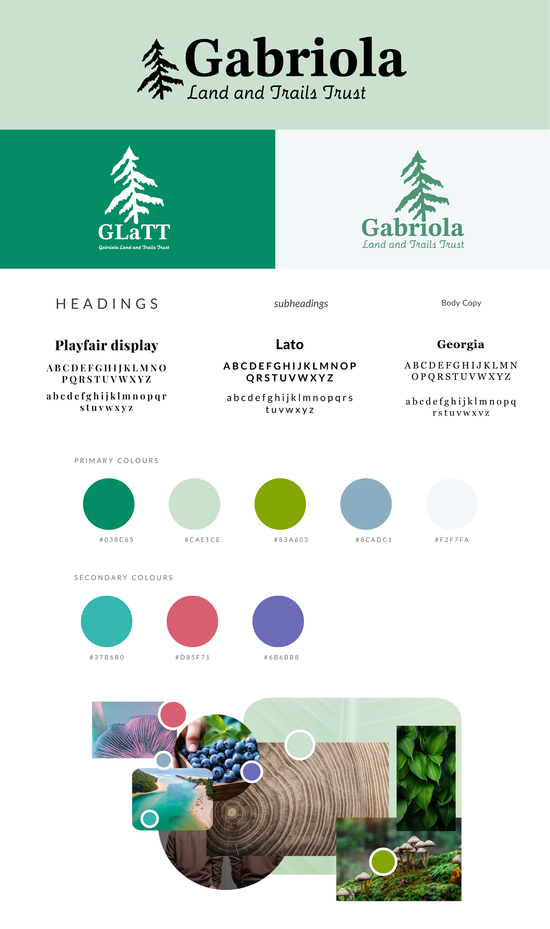
The original logo and typography were updated to better align with GaLTT’s mission. I chose Playfair Display for headings, providing a classic and modern contrast, and paired it with Lato for subheadings, offering clean readability. For the body copy, I selected Georgia, a font that brings warmth and approachability. The redesigned logo incorporates natural elements like trees, symbolizing GaLTT’s strong connection to nature. The new logo is clean and modern, reflecting the organization’s values of environmental stewardship and community engagement.
Colour Palette
The colour palette was carefully selected to reflect GaLTT’s dedication to nature. The primary colours, such as #038C65 (green) and #CAE1CE (light green), evoke the lush landscapes of Gabriola Island. These colours promote trust, responsibility, and a sense of calm, while the secondary colours, including #37B6B0 (teal) and #D85F71 (coral), introduce warmth and approachability to the design, helping to engage and invite the community.
Logo and Typography Redesign
The original logo and typography were updated to better align with GaLTT’s mission. I chose Playfair Display for headings, providing a classic and modern contrast, and paired it with Lato for subheadings, offering clean readability. For the body copy, I selected Georgia, a font that brings warmth and approachability. The redesigned logo incorporates natural elements like trees, symbolizing GaLTT’s strong connection to nature. The new logo is clean and modern, reflecting the organization’s values of environmental stewardship and community engagement.
Colour Palette
The colour palette was carefully selected to reflect GaLTT’s dedication to nature. The primary colours, such as #038C65 (green) and #CAE1CE (light green), evoke the lush landscapes of Gabriola Island. These colours promote trust, responsibility, and a sense of calm, while the secondary colours, including #37B6B0 (teal) and #D85F71 (coral), introduce warmth and approachability to the design, helping to engage and invite the community.

Website Redesign
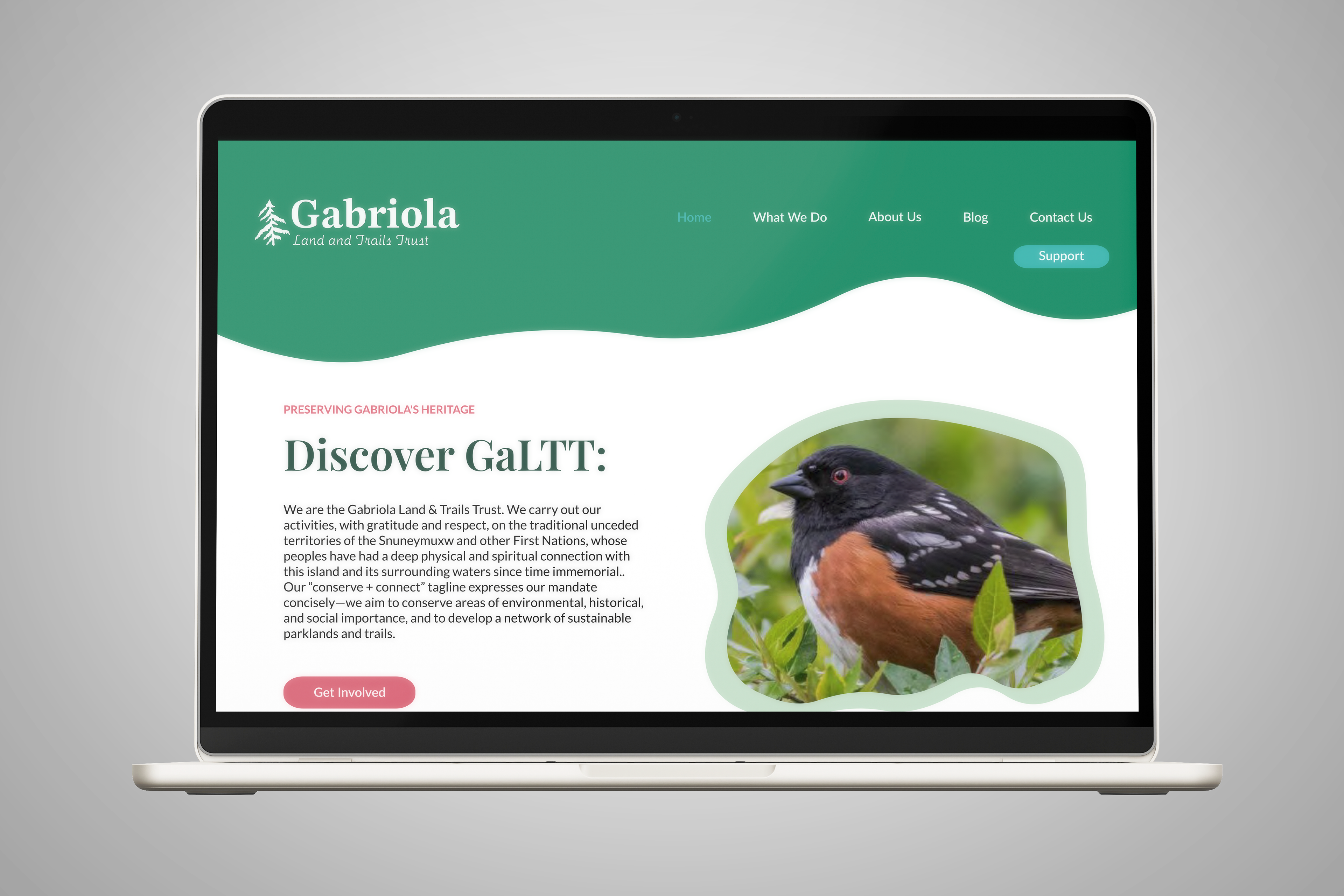
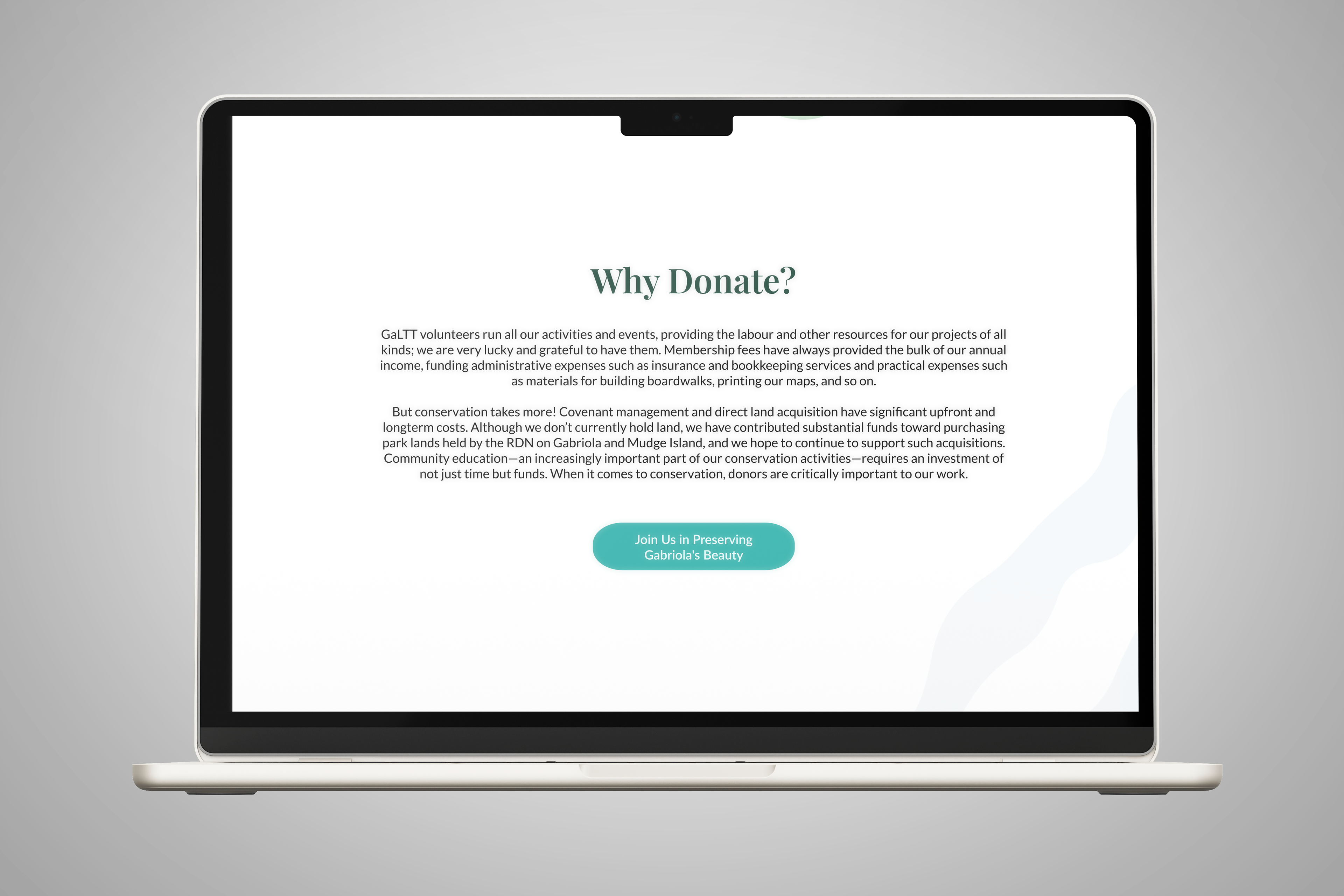
A major component of the rebrand was the website redesign. After auditing the existing site, I identified issues such as blurry images, overcrowded menus, and a lack of effective calls-to-action. To address these, I created a new wireframe in Figma, ensuring the site had a clean, bright, and cohesive design. One of the key design strategies was to incorporate shapes from the new logo throughout the website. These shapes were used to create background elements, buttons, and icons, helping tie the entire design together. This not only reinforced the visual identity but also created a seamless, cohesive user experience. The result was a site that is not only visually consistent with the new branding but also more user-friendly and engaging, with clearer calls-to-action to drive interaction and support.


Challenges and Insights from the GaLTT Rebrand
The GaLTT rebrand presented the challenge of creating a modern visual identity while staying true to the organization’s roots in Gabriola Island’s natural beauty and community spirit. I aimed to balance a contemporary design with elements that evoke the island’s organic, natural feel, ensuring the branding felt grounded and connected to its local context. At the same time, as a non-profit, it was important to design an identity that was approachable and welcoming, yet direct enough to convey the urgency of their conservation work. This required a careful mix of modern design with earthy, organic elements to maintain a sense of trust and connection with the community.
